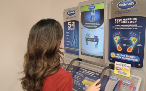
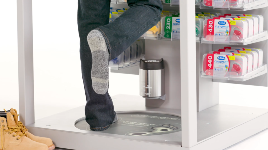
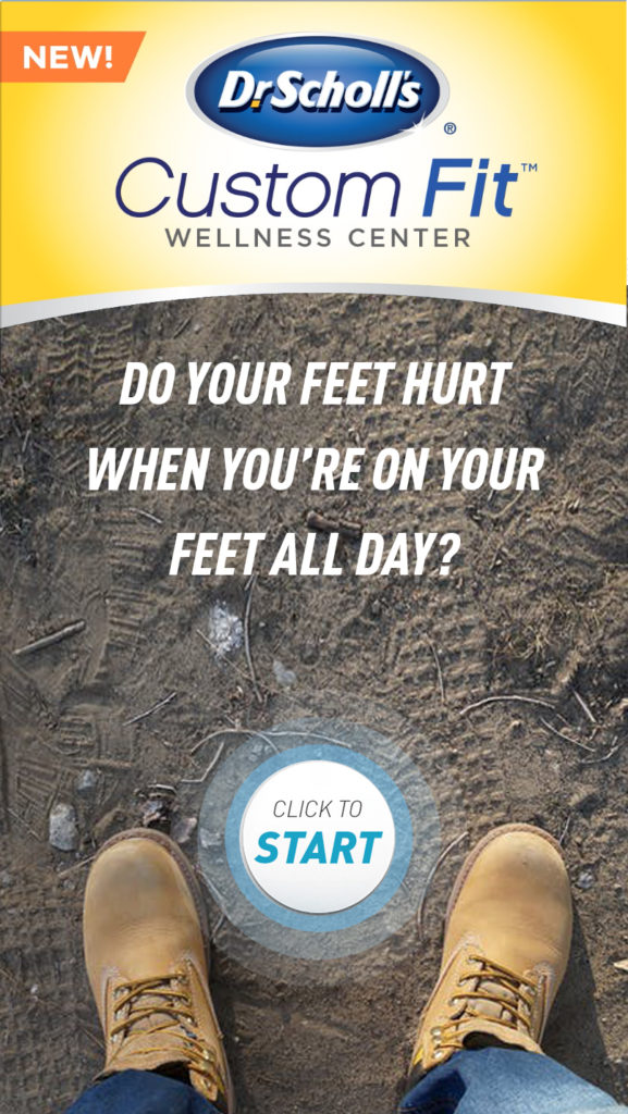
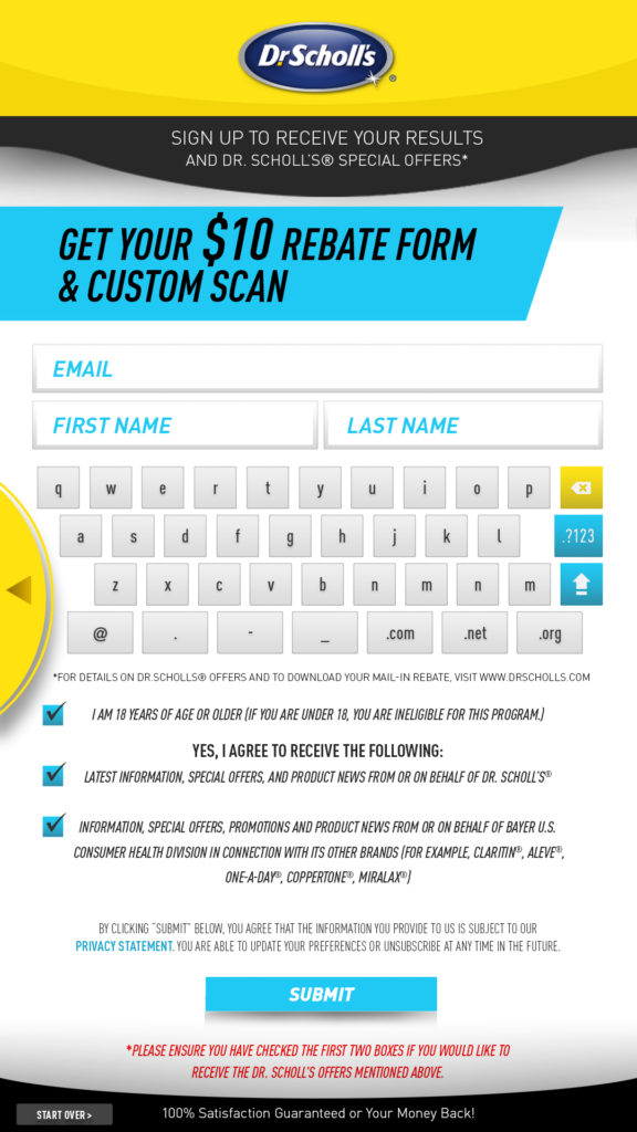
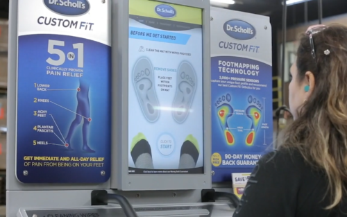
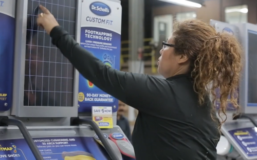
Dr. Scholl’s needed to replace an aging retail kiosk that could no longer support its expanding Custom Fit product experience. I led the UX architecture, interface design, visual direction, and instructional motion experience for a new generation of more than 5,000 kiosks, working closely with product leadership, Bayer stakeholders, project management, and development for over two years.
Role: Creative Lead / UX and UI Design Team: Project manager, development lead and engineering team, Bayer stakeholders Duration: More than two years Platform: Retail touchscreen, pressure sensors and Microsoft Kinect Scale: Architecture created for more than 5,000 kiosks
Next Generation AI Kiosk
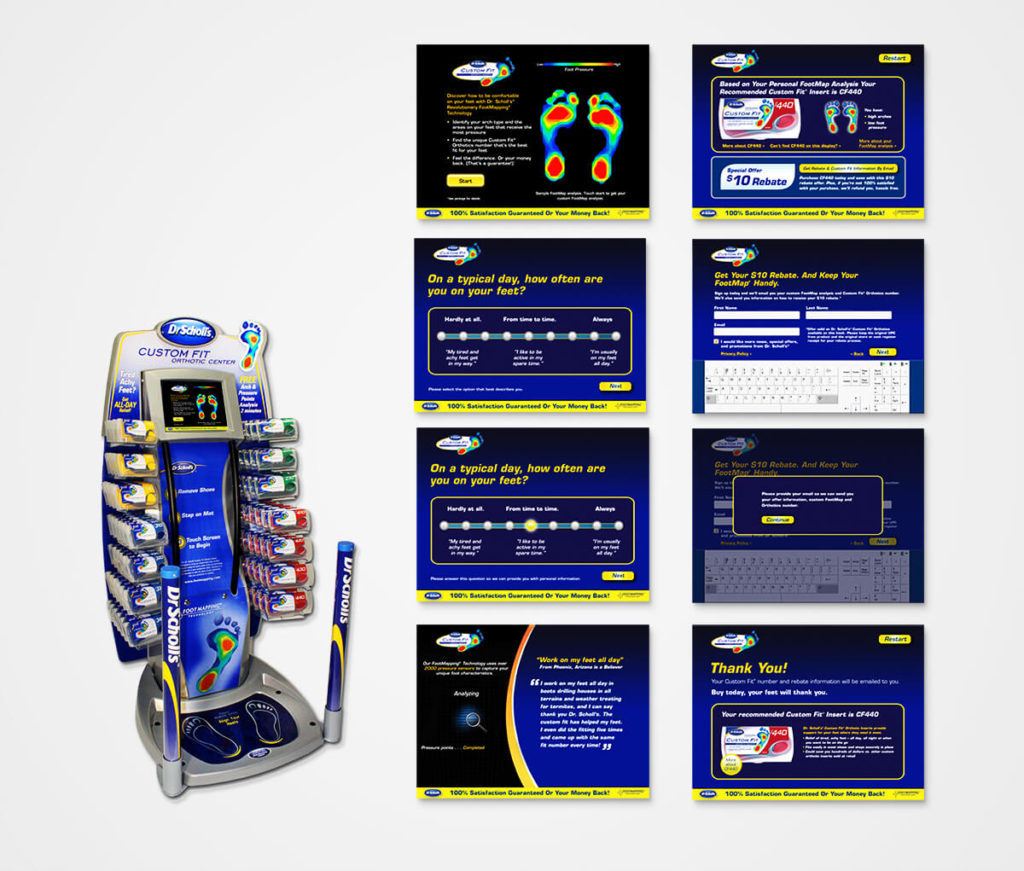
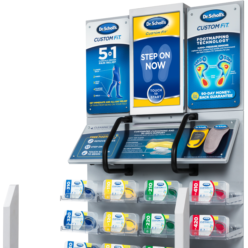
“The original kiosk had launched nearly a decade earlier and was beginning to show its age. Retailers were considering removing the existing kiosks from their stores, which would have meant losing valuable in-store locations and making the Custom Fit Orthotic product less accessible to consumers.
This initiative and Kevin’s hard work helped ensure that Dr. Scholl’s Custom products could remain in stores while giving consumers access to personalized products designed to improve their lives. Thank you from me and the entire Bayer project team.”
-Rama P. | Bayer Technical Development Manager, North American Headquarters
The Problem
The original kiosk had become outdated for users, and retailers were considering removing units from stores. At the same time, Dr. Scholl’s wanted to expand beyond orthotics by introducing custom ankle and knee-brace recommendations. The existing technology and interface could not support the new scanning, movement, and positioning requirements. A totally new user experience was required to par with the new AI technology. A new way of gesture scanning and UI digital screen communication from user to machine had to be defined and built.
The assignment became a complete reboot: Rethinking the user journey, introducing new body-scanning technology, building an entirely new interface, and connecting the digital experience to a highly technical physical machine. I served as the project’s sole creative and UX lead, owning the experience from early concept through nationwide production.
Problem Solving
Customers often knew where they experienced discomfort, but they did not necessarily understand what type of support they needed or how to select the right product.
The existing kiosk could analyze pressure beneath the feet, but it was outdated and unable to perform the new ankle and knee measurements required for personalized braces. The experience also needed to explain a technically complicated scan in a way that felt simple, credible, and approachable inside a busy retail store.
We were not merely adding new screens. We had to determine how an ordinary customer could position their body correctly, complete a scan without assistance, understand what the machine was analyzing, and trust the resulting recommendation.
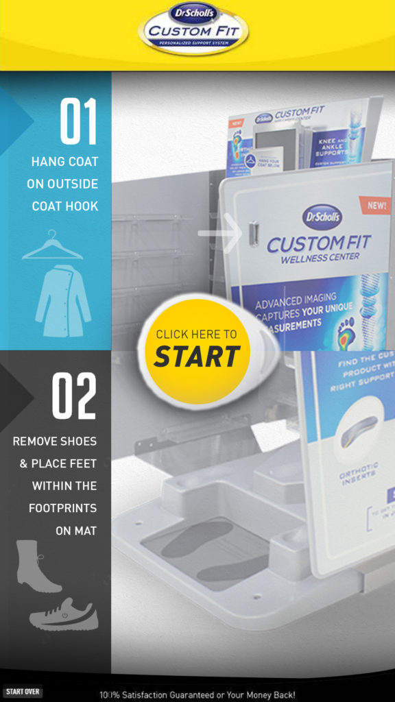
The older outdated Kiosk
The Users and Their Needs
The kiosk had to work for shoppers of different ages, heights, physical abilities, technical confidence, and levels of pain. Users needed to understand an unfamiliar scanning process quickly, position themselves correctly, and trust that the resulting product recommendation was based on their individual body and pressure data.
The Business Goals
1) Preserve Dr. Scholl’s valuable retail presence.
2) Modernize the aging kiosk experience with new AI technology.
3) Support custom insoles, knee braces and ankle braces.
4) Improve completion and reduce confusion for users.
5) Create an experience that could scale across thousands of locations.
Primary Goals
The primary goal was to expand the kiosk from an orthotic recommendation tool into a broader personalized support platform.
The new experience needed to:
– Support custom-fit insoles, ankle braces, and knee braces
– Modernize the Dr. Scholl’s retail experience
– Guide customers through technically precise scans without requiring store assistance
– Translate body and pressure data into understandable visual feedback
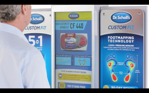
– Recommend the appropriate product and size
– Create a scalable experience that could be manufactured and deployed nationally
– Move from concept to production on an aggressive timeline
Target Users and Their Needs
The target user was someone experiencing pain, instability, fatigue, or discomfort in their feet, ankles, or knees who did not know which support product was appropriate.
– They needed the experience to tell them:
– Where to stand and how to position themselves
– When and how to lift a leg for an ankle or knee scan
– Whether the machine had captured a usable reading
– What the scan revealed
– Which product was recommended and why
– How to correctly put on and use that product
– The interface had to feel fast and effortless, even though a sophisticated combination of pressure sensing, body tracking, data analysis, and product logic was operating behind it.
Early Conceptual work
My Role
I translated business, technical, and user requirements into a coherent experience, moving the project from research and early architecture through wireframes, high-fidelity UI, animation direction, user testing, development coordination, and implementation. I was the sole creative lead responsible for defining the entire experience.
I created the UX architecture, interaction model, interface design, visual language, scan sequences, instructional content, data visualizations, motion direction, and product-recommendation journey. My work also extended beyond the screen. I collaborated with the physical kiosk team to align the interface with the camera, pressure plate, screen, user position, and overall machine construction. The physical and digital systems had to operate as one experience.
I worked in a hybrid capacity, developing much of the work remotely while regularly joining the development team on-site to review the latest builds, test the technology, and solve issues directly. I also participated in Bayer stakeholder meetings, where I explained the process, established expectations, presented progress, and helped maintain the timeline between UX decisions and development.
Creative Direction
The core team consisted of:
– Me as the sole creative and UX lead
– A project manager
– My lead development counterpart and his development team
– An animator I helped identify and select
– The physical kiosk and hardware team
– Bayer and Dr. Scholl’s stakeholders
Because there was no established blueprint for the new experience, I frequently served as the bridge between business expectations, technical capabilities, physical engineering, animation, and the customer journey.
Creative Direction & Development Partnership
My development counterpart and I worked especially closely throughout the project. This experience could not be designed independently and handed off later because every interaction depended on what the scanning technology could reliably detect—and how clearly that information could be translated for users on screen. Design and development had to evolve together.
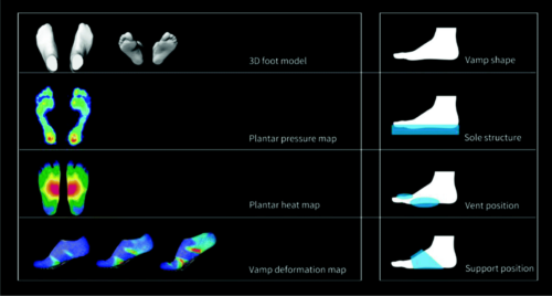
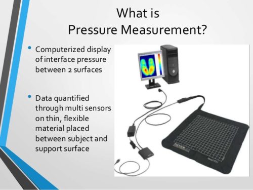
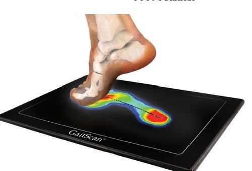
The existing system measured subtle shifts in weight through pressure sensors beneath the user’s feet. To support new ankle and knee-brace recommendations, that capability had to be re-calibrated and integrated with a secondary camera system that could interpret body position and movement.
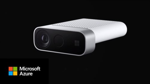
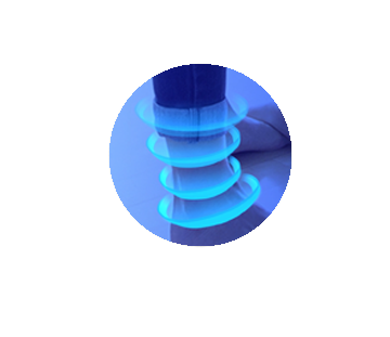
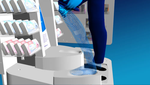
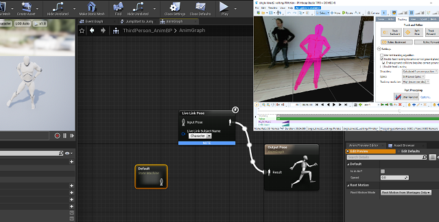
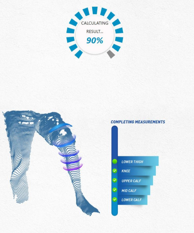
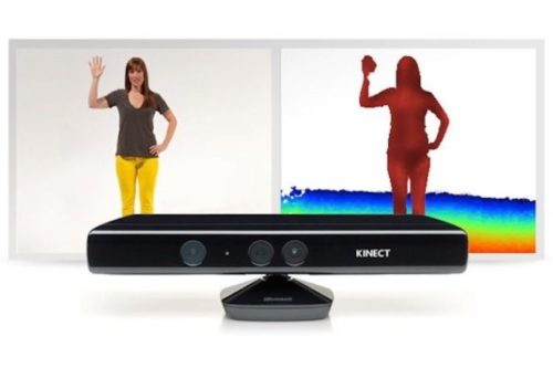
This required us to rethink the kiosk’s operation around Microsoft Kinect and later Azure Kinect AI technologies. These systems analyzed large numbers of body and movement data points, while the interface guided users into the correct position and translated the scan into a clear, personalized recommendation for an insole or brace.
The technical details were complex, but the purpose was simple: create an experience people could understand, trust, and use successfully—and help improve mobility and comfort for millions of customers.
Constraints
We began with very little usable guidance or source material. There was no defined experience for scanning the ankle or knee, no meaningful archive of prior design files to build from, and no established interaction model for what we were being asked to create. At the same time, the production schedule moved quickly.
The major constraints included:
– An aggressive concept-to-production timeline
– Limited usable legacy files
– No existing UX model for the expanded scans
– Hardware and software that were still evolving
– The need to find and direct a specialized animator
– Physical positioning requirements that users had to follow precisely
– The cost of producing a reliable 3D body-analysis system at retail scale
– The need to make the experience usable without trained assistance
We were effectively designing the product, the instructions, and the language of the technology at the same time.
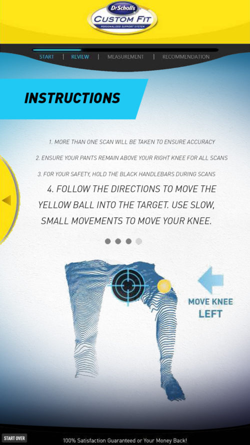
One solution was a live visual target that translated body positioning into an understandable on-screen action. Users moved their body until the tracked point aligned with the target, turning an invisible technical requirement into immediate visual feedback.
Designing Around Emerging AI and Kinect Recognition
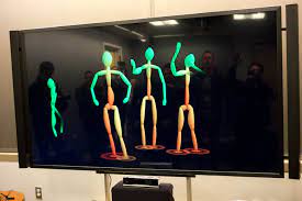
The next-generation kiosk used Microsoft Kinect depth sensing, skeletal tracking and early machine-learning recognition to identify a user’s position and movement without requiring physical contact. The technology was innovative, but it had not previously been configured for this type of detailed retail healthcare experience. The technical system could recognize the body, but it could not guarantee that shoppers would stand at the correct distance, position their legs accurately, remain still, or understand what the machine expected. My challenge was to design the interface and visual guidance around those limitations.
The team first created a prototype using another scanning service, but it did not provide the combination of analysis, flexibility, and affordability the program required. We ultimately shifted to Microsoft Kinect, whose depth sensing and skeletal tracking gave the development team a stronger foundation for detecting and analyzing the user’s lower body. That change affected the entire experience. The technology had to determine where the person was standing, identify joints and body regions, analyze position and movement, and combine that information with the pressure plate beneath the user’s feet.
Kinect offered an unusually accessible platform for full-body motion analysis at the time, although published research also showed that its accuracy varied depending on the direction and type of movement being measured. That made user positioning, calibration, feedback, and scan instructions essential parts of the design—not secondary instructional details.
What testing revealed
Early testing revealed that positioning was one of the greatest barriers to a successful scan. Users did not always stand at the correct distance, position their feet and legs accurately, or understand how their movements affected the system. The technology could recognize a body, but inconsistent positioning could produce an incomplete or less reliable reading.
We repeatedly tested and re-calibrated the experience. At different points, I changed the interface flow, on-screen prompts, visual targets, feedback states and animated instructional videos. When wording alone was insufficient, we created new motion sequences that demonstrated the exact stance or movement required. These changes helped users understand how to interact with the system and supported more consistent custom-fit results.
Designing the Scan Experience
The most difficult UX problem was teaching someone how to use a machine they had never encountered before.
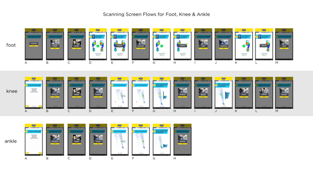
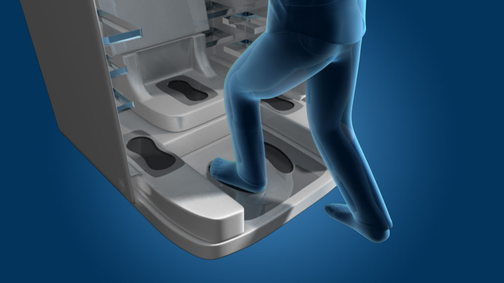
For foot analysis, the pressure plate measured weight distribution and stance. For ankle and knee analysis, the customer had to position their body correctly and, during certain sequences, lift a leg so the system could obtain a clear reading.
The experience was also grounded in existing evidence rather than intuition alone. We reviewed internal Bayer research, prior customer feedback, testimonial data, and known pain points from the earlier kiosk. We used those findings to plan user testing around comprehension, physical positioning, scan confidence, task completion, and the points where customers were most likely to hesitate or abandon the experience. That research helped shape both the flow and the instructional content before the final system moved into production.
I created instructional videos and animated guidance showing exactly how the user should stand, shift, and lift their leg. These were not decorative animations. They were necessary components of the scanning system because unclear movement could produce an incomplete or inaccurate result.
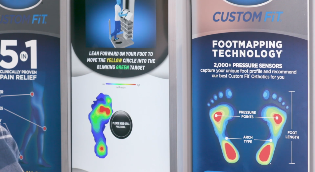
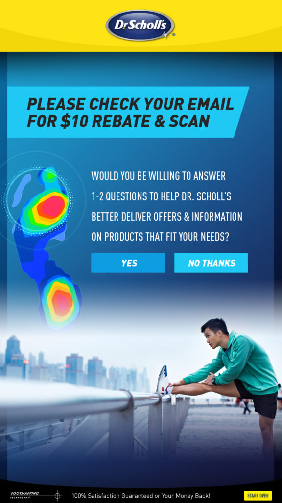
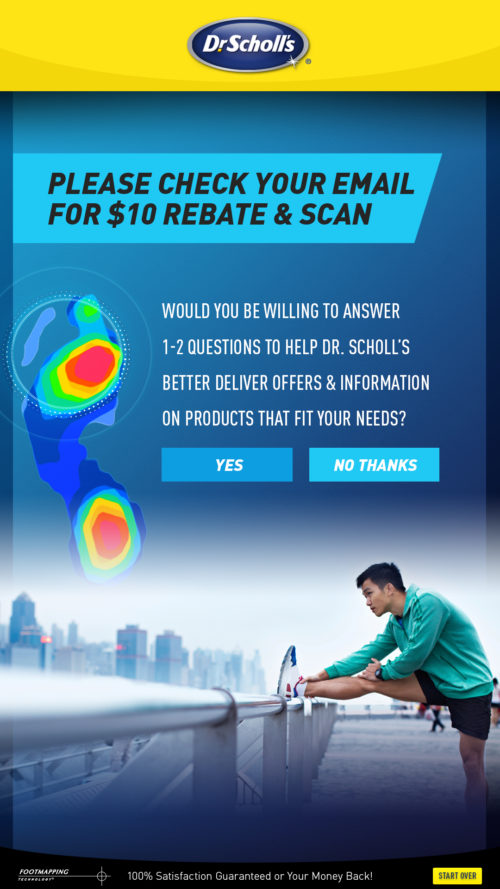
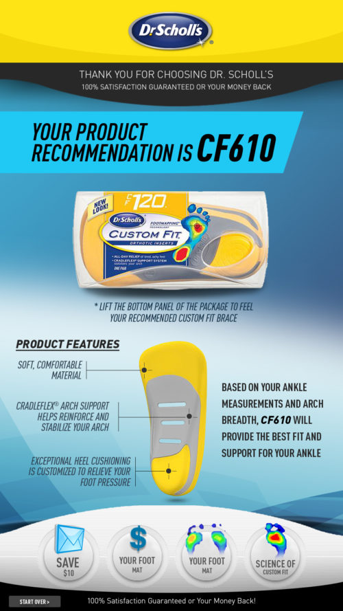
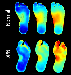
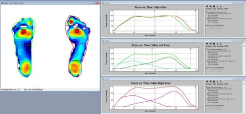
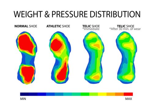
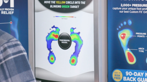
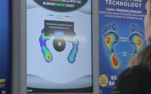
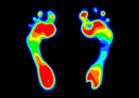
I also developed the visual treatment for the scan itself. The system’s raw measurements needed to become understandable feedback, so I created a colorized pressure visualization connected to the calibrated pressure-pad data and Kinect analysis. The user could see that the machine was actively interpreting their stance rather than simply completing an unexplained technical process.
What Worked
The strongest decision was treating UX, development, motion, hardware, and data visualization as one connected system.
Visual rather than text-heavy guidance Physical movement was easier to communicate through animation, targets and direct visual feedback.
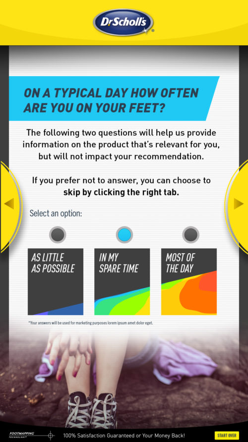
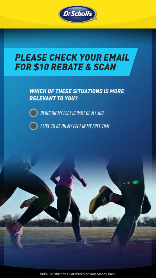
One action at a time The streamlined flow reduced unnecessary choices, clicks and instructional copy.
Visible personalized data Pressure maps, body scanning and the generated avatar helped users understand that the recommendation was based on their own information.
Continuous design and development collaboration Working directly with development allowed the interface to evolve as the scanning technology and user behavior revealed new needs.
Working directly with development allowed us to test assumptions early and adjust the experience around the realities of the technology. The instructional animation helped turn complicated body-positioning requirements into something an unassisted retail customer could follow.
Moving to Kinect also gave the project a more practical foundation for body tracking and enabled the wider vision for ankle and knee analysis.
What Did Not Work Initially
Our first scanning approach was not strong enough to meet the project’s technical, analytical, and cost requirements. Continuing with it would have compromised either the scan quality or the ability to deploy the system at scale.
The lack of established requirements also created rework. Some experience decisions could only be made after the development team tested what the technology could actually recognize. Rather than following a conventional linear hand-off, we had to repeatedly evaluate, redesign, and re-calibrate the experience.
The project reinforced that emerging technology cannot be designed around idealized assumptions. The interface must respond to what the system can consistently accomplish under real-world conditions.
Outcome
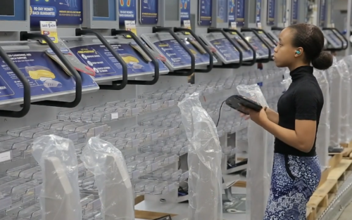
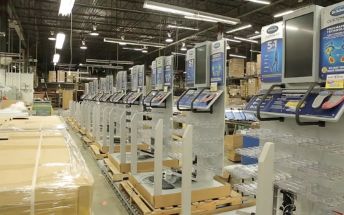
The kiosk moved beyond concept and prototype into full production. More than 5,000 units were built for nationwide retail deployment based on the UX architecture and visual experience I created.
The public Dr. Scholl’s system has been documented as using pressure mapping and algorithmic analysis to recommend products based on individual foot characteristics. A later redesign partner also reported the Dr. Scholl’s kiosk network operating at a scale of 5,000 stores and receiving approximately 18 million user interactions annually, although that 2020 work represents a later iteration and should not be presented as a direct measurement of your version.
Deployed Nationwide
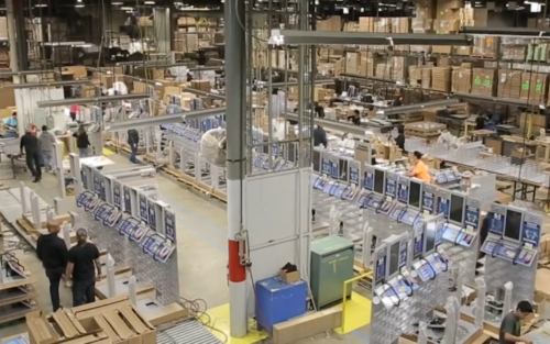
The redesigned experience advanced from an undefined technical challenge to a fully manufactured retail platform, with more than 5,000 kiosks produced for nationwide deployment.
“The original kiosk had launched nearly a decade earlier and was beginning to show its age. Retailers were considering removing the existing kiosks from their stores, which would have meant losing valuable in-store locations and making the Custom Fit Orthotic product less accessible to consumers. This initiative and Kevin’s hard work helped ensure that Dr. Scholl’s Custom products could remain in stores while giving consumers access to personalized products designed to improve their lives. Thank you from me and the entire Bayer project team.”
-Rama P. | Bayer Technical Development Manager, North American Headquarters
What I Would Do Differently Today
Today, I would introduce structured research and measurement earlier and use modern AI selectively to improve both the production process and the user experience.
We did plan user testing, review earlier customer feedback and testimonial data, study known pain points, and use internal research to guide the new experience. What I would strengthen today is the continuity of measurement after launch. I would create a more formal connection between the original research, prototype testing, nationwide deployment, and long-term performance so the team could clearly track how the experience affected scan completion, abandonment, recommendation confidence, accessibility, product selection, and conversion over time.
What I would strengthen today is the continuity of measurement after launch. I would create a more formal connection between the original research, prototype testing, nationwide deployment, and long-term performance so the team could clearly track how the experience affected scan completion, abandonment, recommendation confidence, accessibility, product selection, and conversion over time.
Modern computer vision and AI could now help improve pose recognition, identify an incorrect stance earlier, adapt instructions in real time, and explain scan results more conversationally. However, I would keep transparent rules and human review around any health-related recommendation rather than presenting AI output as a diagnosis.
We solved an extraordinary number of problems under pressure and time, but stronger documentation, earlier validation, and clearer success criteria would have reduced rework and made the project’s business impact easier to prove.
The project reinforced that advanced technology is only successful when people clearly understand what it needs from them. The strongest solution was not simply improving recognition—it was designing a human experience that helped the recognition system perform successfully.